
This blog is for the HCI 596 course being taught at Iowa State University through it's Human-Computer Interaction program.
Sunday, September 16, 2012


Sunday, November 13, 2011
Encoding Emotion
This post is in response to Brave and Nass's question "How does emotion play out in computer-mediated communication (CMC)?" in Chapter 4 of The Human-Computer Interaction Handbook...
Emotion certainly plays a significant role in how we communicate with one another by providing a "social context" that seems to define the ways we communicate with one another. A smile on your face indicates to me you are feeling positive and are therefore likely more approachable and receptive to conversation than an individual with a grimace. It seems strange that computers have remained rather removed from needing to understand and convey their user's emotional experience. In many ways, computers have mostly been viewed as a cognitive tool but since computers are now being more and more used as mediums for creativity, connectivity, and interaction among people, we need to consider ways emotion can be encoded into the experience.
Emoticons became necessary because the types of interaction made possible via the Internet could not alone provide the context necessary for the communication. There are still, however, many emotions that cannot or effectively be conveyed through emoticons alone (e.g. sarcasm). Avatars in 3D games have employed emoticon type gestures that allow their character to exhibit behaviors that demonstrate one's mood (e.g. World of Warcraft characters can cheer or dance to celebrate a significant event) but these too often fall short. Emoticons of this type are low-bandwidth emotion conveyers. What's missing is the continuous and high-bandwidth emotional expression one can perceive from direct interaction with one another. Video communication (e.g. Skype) is highly effective, but video communication cannot as easily be shared, transmitted, or processed as text. An important realization I've had is that emotions are experienced; they are not static. Emoticons are attempting to use another mode or dimension of textual interaction to efficiently "package" emotion into the textual experience--that is difficult to do and which is why they still fall short. Perhaps another mode that could be adopted for conveying emotion textually could be to standardize colors to sentences that indicate tonality, pitch, or cadence (i.e. much like music notes written on a sheet of music). While not ideal aesthetically, this capture would allow emotion to be captured in the communication.I will soon start a new job at a small company. One important requirement levied by the hiring company was for attaining highly effective communication skills across many mediums and modes given the fact the team is spread around the world. Ideally I should be sure to spend time with these individuals in person to help define a "social context" that will help me "understand them". This provides me the means to know how to communicate with them effectively. We will also set up a "portal" that is a 24 hours a day, seven days a week television screen with a webcam linked directly to other portals around the world. The idea is that the portal will provide for higher-bandwidth communication than email can currently provide. The portal will allow the us as users to feel connected to the other working spaces rather than disconnected and reunited for minutes at a time with video chat like Skype.Thursday, October 6, 2011
InVision: Creating Fully Interactive Wireframes & Prototypes Easily and Beautifully
InVision looks to be extremely cool for the talented dual visual/UX designers who want to get slick looking prototypes out quick.
I recently used Axure RP for prototyping a lo fi interactive prototype for a craigslist redesign but ultimately I was really disappointed in the level of interactivity and the overall look of how the final prototype appeared. Later I used Flex to develop a higher fidelity protoype for a new interactive online shopping application but also found that styling the Flex app proved to be lacking in true artist customization.
Now, the only functionality I can tell that you can add is linking to other mock up which isn't exactly as capable as something like Axure pre-coding (which may be its weak point), but I think my favorite feature is simply being able to directly port a rather slick looking Photoshop, Illustrator, etc. mockup and make it function quickly as a lo-fi prototype. Often times it seems a client will be more interested in how it looks then how it operates (however unfortunate that may be...). InVision will allow the taltend visual/UX designer to create the look and functionality simultaneously into prototypes. Cool idea though in reality you could probably just create slices and quickly code some HTML to do the same. For the price tag, not sure I'd get it, but nevertheless a cool idea.
Friday, September 16, 2011
Mashable.com 9 Essential Resources for UI Designers
Mashable put out an article today that I think provide a few good resource for UI inspiration, best practices, and guidance:
http://mashable.com/2011/09/16/ui-design-resources/
Thought I would share. Always nice to see what others are up to.
http://mashable.com/2011/09/16/ui-design-resources/
Thought I would share. Always nice to see what others are up to.
Monday, August 8, 2011
Manners and HCI Design
It's fairly frequent to hear discussions about our (humans) manners and dealing with new devices. As we adopt new technologies it takes a while to figure out how to incorporate the changes in lifestyle in a way that promotes civility between one another. But that's not what I'm talking about. I'm talking about the manners that the devices and applications we create have.
In my day job I frequently deal with creating alerts for users. In my users' field of work it is important that they are alerted sometimes--even if we have to be a bit obnoxious about it--lives are at stake. But as I microwave a burrito for breakfast and then go attend to a few things while it cools down, it's not really important that I be alerted every 60 seconds that the burrito is done. In fact I rarely forget that I put food in the microwave but I frequently want to let it sit there for a few minutes to cool down. But the designers of my cool looking microwave didn't realize that. As I try to reverse engineer the personas they were expecting to buy said shiny appliance, I can see two possible audiences my microwave is designed for:
In my day job I frequently deal with creating alerts for users. In my users' field of work it is important that they are alerted sometimes--even if we have to be a bit obnoxious about it--lives are at stake. But as I microwave a burrito for breakfast and then go attend to a few things while it cools down, it's not really important that I be alerted every 60 seconds that the burrito is done. In fact I rarely forget that I put food in the microwave but I frequently want to let it sit there for a few minutes to cool down. But the designers of my cool looking microwave didn't realize that. As I try to reverse engineer the personas they were expecting to buy said shiny appliance, I can see two possible audiences my microwave is designed for:
1) A user who is old and senile and typically forgets within 3 minutes that they have put food in the microwave and needs to be reminded.
2) A mega-stoner who has the munchies but forgot that they were already cooking those Hot Pockets.
Unfortunately for GE I am neither one of these people and I now have an active dislike for GE and their no-user-scenario-using, beep-making product designers. It's not like an oven where the house could catch fire if you go on vacation with it on. No, microwaves turn off when the little timer goes off. Worst case scenario is cold soup.
Another example that I see more and more online is the pop-up survey within seconds of a page loading. "Would you like to take this survey?" it asks. No, users are not invested in content at this point nor has the site made a good impression on the user. As a researcher and occasional surveyor I get the usefulness of surveys. They are easy, inexpensive and don't take much time. But we have to look at their other qualities--annoying, interrupting and boring--especially when we are asking people to volunteer to give their time and attention to the site's cause without compensation. It's not that surveys are wrong but we must employ them in a manner that models our polite standards of interactions. When we talk about user centered design vs task centered or goal centered, I think the use of manners is a possible discriminator for user centered design. If we are always designing for a person then we are less likely to neglect those sociological and communicative details that affect the experience for the end user. And this user sure would appreciate that.
This stuff really matters...
http://www.edibleapple.com/apple-gets-creative-with-icloud-error-messages-photos/
....but it only matters insofar as most software is devoid of decent error messaging. It doesn't have to go to quite such a cutre extreme as this example from Apple, but consider that often the most direct communication you make to your users comes in the form of error messages.
At work, people have learned to not glibly state in front of me: "Just post a big red error message when that happens. Maybe throw in an exclamation mark, a big red X, or heck, why not a skull and cross-bones?" But that is the common approach: use this moment of one-to-one messaging to bolster a class/power division between you and your users: in effect, slap them down and show them who's boss.
....but it only matters insofar as most software is devoid of decent error messaging. It doesn't have to go to quite such a cutre extreme as this example from Apple, but consider that often the most direct communication you make to your users comes in the form of error messages.
At work, people have learned to not glibly state in front of me: "Just post a big red error message when that happens. Maybe throw in an exclamation mark, a big red X, or heck, why not a skull and cross-bones?" But that is the common approach: use this moment of one-to-one messaging to bolster a class/power division between you and your users: in effect, slap them down and show them who's boss.
Interactive and Input Devices, The Buxton Collection
Bill Buxton is a researcher for Microsoft. He's written a cool book that we saw early in this summer in this very blog. He's also been collecting interactive and input devices for decades. Although these items might not be showing up at our local museums anytime soon, we can still check them out online at the Buxton Collection. The collection takes us through a visual history of the input devices that have played their own role in creating and shaping our field.

The General Magic Data Rover 840 with sweet physical metaphor action.

The Versatron Foot Mouse. One might think this is marketed towards someone with a medical condition or extreme environment, but no--it's marketed as an improvement over your everyday hand mouse. I think this bad boy from 1984 is exactly what you need for your ottoman if you're a laptop couch junkie.

Okay, I admit, I picked this delight from Zenith simply because it is called the Space Command SC 600-X. Why didn't that name stick? It's way cooler than "remote control" or heaven forbid "clicker."
Some highlights:
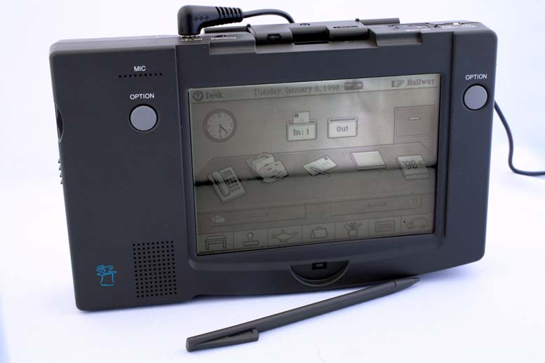
The General Magic Data Rover 840 with sweet physical metaphor action.

The Versatron Foot Mouse. One might think this is marketed towards someone with a medical condition or extreme environment, but no--it's marketed as an improvement over your everyday hand mouse. I think this bad boy from 1984 is exactly what you need for your ottoman if you're a laptop couch junkie.

Okay, I admit, I picked this delight from Zenith simply because it is called the Space Command SC 600-X. Why didn't that name stick? It's way cooler than "remote control" or heaven forbid "clicker."
Thursday, August 4, 2011
Captcha
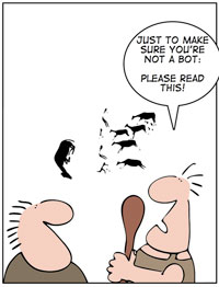

It didn't take me long to realize that I wasn't a fan, and that I wan't figuring anything special out. So I got to thinking again. I remember watching Tron and thinking man it's so easy to tell his face is CGI, I wonder how well a computer can tell a CGI face from a real face, I know I can. What if a 2nd gen captcha had two faces a CGI face and a real one and the question was posed, "which of these is a real person?"


Can you answer? I think I can, can a robot answer? no clue.
Wednesday, August 3, 2011
UMEX, a shorter alternative for the already short SUS?
As you might have noted
from one of my previous blogs (SUS), I am a big fan of usability analyses and
statistics. One thing I have found time and time again, is that it can be very
difficult to get participants to take surveys seriously. There often seems to
be a sweet spot when the user has less than 5 questions, but over 10 questions
and, whether you want to admit it or not, the number of bad data participants
increases exponentially. That said, I came across a study recently by
researchers at Intel that encountered a similar problem when attempting to
incorporate a 10-item, five-point Likert scale called the System Usability
Scale (SUS). To solve this, they decided to empirically reduce the number of
questions by using only the highest correlating questions from a modified
version of the SUS. The SUS was chosen because it had been extensively tested,
and has proven to be a reliable representation of user satisfaction and system
usability. However, by cutting down the number of questions from the SUS, it
would also reduce the amount of data points, to help offset this, the Likert
scales increased from 5 to 7 points. Increasing to a 7 point Likert was also
heavily backed up by previous research (see Diefenbach et al. (1993), Cox
(1980)). The results of the research was titled the Usability Metric for User
Experience (UMEX).
It was concluded that
the UMEX is a “reliable, valid, and sensitive alternative to the System
Usability Scale.” It has a high correlation with SUS at that of above 0.80.
Because of this, it is suggested that the UMEX is fully capable as acting as a
standalone application for usability testing. More so, because of its compact
size and ease of application, the Umex is attributed by a fundamental
requirement by the Use Experience community: “in order to measure user
experience effectively, its components need to be measured efficiently.”
I have not ever used the
UMEX or anything like it. I can not say it should be used, I just think someone
doing a quick and dirty study might like using it.
Color contrast Calculator
Ok, so in the last post I wrote about color contrast and provided
some links to a few calculators. I found however, that the calculators have all
been designed for the designers and not for the usability tester. So the bold,
adventurous spirit that I am… not really, just interested enough, decided to
prototype one. Ok, so it is very early in the Alpha phase, and yes I designed
it in excel… but I think it has a lot of potential.
Here’s what it does.
- . Provides the practitioner with an eyedrop color selector. Many times when doing analyses, we do not have access to the original code, and even if we did, going through code to find a hexadecimal color code isn’t exactly the best use of time. Provides a quick pass fail for both color and brightness, as well as a combined pass fail.
- . Shows percentages for acceptance
What it should/ will do
- Accept text size
- Have a second tester for background contrast. A big problem with contrast is not just the for/background contrast, but it is also the amount of changing contrast found in the background. For example, if the background is a faded brick wall, although any given color provide plenty of contrast for the forground, the internal contrast between the levels of brick make text reading illegible.
- The program should automatically spit out the text needed to present the data, with descriptive stats included and everything. (i.e., A basic color contrast analyses showed low levels of contrast (CD = 100)…)
- Provide an example of the colors chosen.
- A bread toaster.
I am attaching my first draft for anyone interested in
looking. HERE is the link
Color contrast
Although many color design
rules originated to support visual impairments, they are beneficial for all
users. Reading is not an innate ability; we do not learn to read simply by
watching others read. It requires effortful study and attention. Reading can be
one of the most cognitive recourse intensive things a user does on a website.
For this reason, it is vital that we as UX designers, facilitate easy reading
for all users. This will ultimately help users discern text, paragraphs, and
text bodies much more efficiently. Background / foreground Color testing is
often judged on two primary attributes, the contrast of the colors and the brightness of the colors. Equations
and standards for meeting accessibility requirements have been developed by W3C
http://www.w3.org/TR/WCAG10-CSS-TECHS/.
These standards provide detailed calculations for determining color contrast
effectiveness. These formulas are as follows:
Brightness Difference:
The
brightness difference is found by subtracting the figure index from the ground.
The brightness index is found by multiplying each RGB value by a predefined partition
of 1000. The values are then summed together and then the total is devided by
1000. The value for Red is 299, the value for Green is 587, and the value for
blue is 114. So the completed equation would be: (299R + 587G + 114B)/1000.
Next you subtract the index of the
figure from the background and you have the difference.
figure from the background and you have the difference.
Color Difference
Color
difference is very similar, however, the index is simply a summation of all RGB
values and the difference is found by subtracting one from the other.
The range for color
brightness difference is 125. The range for color difference is 500.
Many calculators have been created to do this for
you.
Tuesday, August 2, 2011
Craigslist? Why bother redesigning it?
After all that grueling work, I come across this link for an Adobe Air desktop app of CL.
http://www.cldesktop.com/
I love the sporadic migration of web apps to the desktop (actually I helped design one: Yousendit's "Express"). Somehow it feels like the barbarians storming the walls.
-Rob
http://www.cldesktop.com/
I love the sporadic migration of web apps to the desktop (actually I helped design one: Yousendit's "Express"). Somehow it feels like the barbarians storming the walls.
-Rob
Existing Product Redesign vs. New Products
There is a very big difference between doing Interaction and Experience design for new products vs doing these tasks for the redesign or upgrade of existing products. My last two jobs were with companies that had established software products and product managers with loads of client and product knowledge. In this scenario, there is much less up-front user research to be done since the feedback is typically steady and a product manager knows the shortcomings and the opportunities for enhancements. Consequently, it is easy to look at the job of Interaction Design more in the middle of the process. From assignments over the course of my classes, it is typically the early research that is lacking in my projects and I've come to realize that only certain, lucky individuals get to do true product research. The discovery of a need may still come from another role such as a product manager or the business portion of a company. But if the product is new, it is the designer and researcher that must use proper methods to discover the use cases. One of the things I look forward to as I move forward in this career is doing proper research on users with interviews, case studies, focus groups and ethnography, to name the main methods.
New Login Designs - New Problems
 I posted something a few weeks about about bad design and noted the issues with single sign-on or the lack thereof.
Recently I came across this post which looks at an emerging issue with a user's ability to login using authentication via an entirely different service, such as Facebook.
This is a login option I don't tend to use - I prefer to keep everything separate - but I thought these stats were interesting, noting how often folks end up with multiple accounts and still can't remember their login:
"User Interface Engineering's analysis of a major online retailer found that 45% of all customers had multiple registrations in the system, 160,000 people requested passwords per day, and 75% of these people never completed the purchase they started once they requested their password. Ouch."
The folks at bagcheck illustrate an approach they're trying in order to help make this type of login easier for the end-user. I like that they show they're process and how it evolves.
What does strike me as odd is that you can see all these other user names when you search for your own... that seems worrisome.
Javascript UI Libraries - Bridging the Gap Between UX Designers and Web Developers
I decided to finish my blog posts with the same topic that I started with - the gaps between the developers and designers. Responses to my first post were interesting and insightful.
Again, I remember people talking about developers shooting down their UX ideas because they simply don't think it is possible given the time-constraints. Javascript UI libraries are rapidly evolving into the role of saviors for both UX designers and developers. There are several javascript libraries out there that makes the job of manipulating a web-page's objects within it's Document Object Model very easy. In addition many common widgets that are used most frequently while designing websites are now emulated by simple to use Javascript libraries. Examples of these commonly used widgets are - Accordions, Drop Down Menus, Dialog Boxes, Minimizable boxes etc,.
Following are a few of the many Javascript UI libraries that make the use of these widgets as easy as a couple of lines of code.
AlloyUI
XUI
Knowledge of the features of these libraries would strengthen your case when a software developer shoots down your proposal stating 'lack of time' as a reason. Software developers in turn can turn themselves into amazing UX developers without much effort if they are familiar with these wonderful tools. Adding new UX features to their repertoire everyday, these libraries are bridging the gap between designers and developers.
Geri Interaction Design: Importance of Logo in Branding
Geri Interaction Design: Importance of Logo in Branding: "New Logo Sketches This is a redesign sketch of a new logo for the HCI site. I attempted to keep some of the same language of the existing l..."
Geri Interaction Design: Card Sort Exercise
Geri Interaction Design: Card Sort Exercise: "Lecture number six had a section about a method of research from the information technology discipline called card sorting. This is a method..."
Geri Interaction Design: Creation of App For HCI site.
Geri Interaction Design: Creation of App For HCI site.: "Wireframe for HCI site This is the wireframe for the proposed redesign of the Iowa State University Human Computer Interaction site. The ho..."
Monday, August 1, 2011
Opportunities for UX Improvement in Retail Websites
My curiosity to know if there are any websites or UX firms that examines different websites for usability metrics led to a few fairly interesting companies, individual blogs and websites. One of my favorite studies conducted by Usography is this UX audit.
Usography reviewed 100 top retail web sites and presented their findings in "Retailer UX Audit". The sites were rated according to a list of 30 user experience feature criteria (listed in the article). The founder of Usography, Paul Bryan, summarized their findings in this article on UXbooth.com. It is interesting to note that on a scale of 30 two companies were were tied for first position. What is more interesting is the fact that these two companies implemented 16 out of the 30 features. I'm sure the article would be even more fascinating to people who worked on the 'Individual Class Project 3' (Socialite) or participated in an in-class activity where we discussed about ideas for a shopping application with social features. Aren't you thrilled to see that some of the best features that were found to be missing from many sites were actually discussed during the in-class activity? For example we discussed about features related to price comparison and visual try-ons. Though companies like Buy.com and Amazon.com which are online-only retailers take the top spots, they only implement half of the features used as the evaluation criteria. This tells us that even in case of mature companies there is a significant potential for UX improvement. I do not believe that implementing all 30 features would increase the sites overall usability. Also a thorough cost-benefit analysis should precede the decision to support implementation of any of the listed features. However this audit provides tremendous value to the companies by pointing-out areas of improvement, without the companies having to invest in a UX evaluation.
Note: Do check-out Usography's website and services. They have an interesting business model and offer several design services with a lot of focus on evaluation.
Usography reviewed 100 top retail web sites and presented their findings in "Retailer UX Audit". The sites were rated according to a list of 30 user experience feature criteria (listed in the article). The founder of Usography, Paul Bryan, summarized their findings in this article on UXbooth.com. It is interesting to note that on a scale of 30 two companies were were tied for first position. What is more interesting is the fact that these two companies implemented 16 out of the 30 features. I'm sure the article would be even more fascinating to people who worked on the 'Individual Class Project 3' (Socialite) or participated in an in-class activity where we discussed about ideas for a shopping application with social features. Aren't you thrilled to see that some of the best features that were found to be missing from many sites were actually discussed during the in-class activity? For example we discussed about features related to price comparison and visual try-ons. Though companies like Buy.com and Amazon.com which are online-only retailers take the top spots, they only implement half of the features used as the evaluation criteria. This tells us that even in case of mature companies there is a significant potential for UX improvement. I do not believe that implementing all 30 features would increase the sites overall usability. Also a thorough cost-benefit analysis should precede the decision to support implementation of any of the listed features. However this audit provides tremendous value to the companies by pointing-out areas of improvement, without the companies having to invest in a UX evaluation.
Note: Do check-out Usography's website and services. They have an interesting business model and offer several design services with a lot of focus on evaluation.
Subscribe to:
Posts (Atom)