Monday, August 8, 2011

Interactive and Input Devices, The Buxton Collection

Bill Buxton is a researcher for Microsoft. He's written a cool book that we saw early in this summer in this very blog. He's also been collecting interactive and input devices for decades. Although these items might not be showing up at our local museums anytime soon, we can still check them out online at the Buxton Collection. The collection takes us through a visual history of the input devices that have played their own role in creating and shaping our field.

Some highlights:


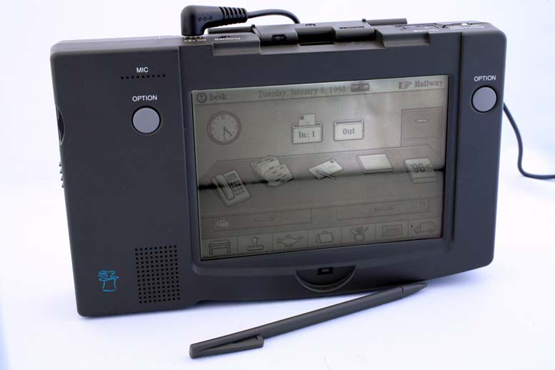
The General Magic Data Rover 840 with sweet physical metaphor action.


The Versatron Foot Mouse. One might think this is marketed towards someone with a medical condition or extreme environment, but no--it's marketed as an improvement over your everyday hand mouse. I think this bad boy from 1984 is exactly what you need for your ottoman if you're a laptop couch junkie.


Okay, I admit, I picked this delight from Zenith simply because it is called the Space Command SC 600-X. Why didn't that name stick? It's way cooler than "remote control" or heaven forbid "clicker."


Thursday, August 4, 2011

Captcha

I have an undying hatred for Captcha, it seems to haunt my self confidence whenever I attempt to submit anything online. All it says to me is that the website has unmanageable amounts of spam and that somehow, it's the users fault. Well, maybe no one is being blamed, but it is the user that gets stuck with the bill. I'm glad our justic system isn't built off the same logic. "Well, to prove your not guilty, we would like you to perform a miracle, someone benevolent and righteous enough to do such a thing could never be guilty." So, anyway, I got to thinking about new ways of Captchaing submissions that lower the amount of cognitive/ sensory resources needed to complete it. Most Captcha designs are based on the computer intelligence tests that somehow go back to the stoneage when all we had were words that were easy to read and words that were hard to read. With all of our intelligence in the fields of computer science, psychology, and AI, is this the best we can do? The first thing I thought was along the same lines as what is currently in market place, a text word written plainly, with a bunch of words and letters scrolling in front of it. The idea is that your brain would focus on the static word, and the fly by decoy words would be ignored. Well, I made an example..


It didn't take me long to realize that I wasn't a fan, and that I wan't figuring anything special out. So I got to thinking again. I remember watching Tron and thinking man it's so easy to tell his face is CGI, I wonder how well a computer can tell a CGI face from a real face, I know I can. What if a 2nd gen captcha had two faces a CGI face and a real one and the question was posed, "which of these is a real person?"


Can you answer? I think I can, can a robot answer? no clue.

Wednesday, August 3, 2011

UMEX, a shorter alternative for the already short SUS?


As you might have noted from one of my previous blogs (SUS), I am a big fan of usability analyses and statistics. One thing I have found time and time again, is that it can be very difficult to get participants to take surveys seriously. There often seems to be a sweet spot when the user has less than 5 questions, but over 10 questions and, whether you want to admit it or not, the number of bad data participants increases exponentially. That said, I came across a study recently by researchers at Intel that encountered a similar problem when attempting to incorporate a 10-item, five-point Likert scale called the System Usability Scale (SUS). To solve this, they decided to empirically reduce the number of questions by using only the highest correlating questions from a modified version of the SUS. The SUS was chosen because it had been extensively tested, and has proven to be a reliable representation of user satisfaction and system usability. However, by cutting down the number of questions from the SUS, it would also reduce the amount of data points, to help offset this, the Likert scales increased from 5 to 7 points. Increasing to a 7 point Likert was also heavily backed up by previous research (see Diefenbach et al. (1993), Cox (1980)). The results of the research was titled the Usability Metric for User Experience (UMEX).  
It was concluded that the UMEX is a “reliable, valid, and sensitive alternative to the System Usability Scale.” It has a high correlation with SUS at that of above 0.80. Because of this, it is suggested that the UMEX is fully capable as acting as a standalone application for usability testing. More so, because of its compact size and ease of application, the Umex is attributed by a fundamental requirement by the Use Experience community: “in order to measure user experience effectively, its components need to be measured efficiently.”
I have not ever used the UMEX or anything like it. I can not say it should be used, I just think someone doing a quick and dirty study might like using it.

Color contrast Calculator


Ok, so in the last post I wrote about color contrast and provided some links to a few calculators. I found however, that the calculators have all been designed for the designers and not for the usability tester. So the bold, adventurous spirit that I am… not really, just interested enough, decided to prototype one. Ok, so it is very early in the Alpha phase, and yes I designed it in excel… but I think it has a lot of potential. 
Here’s what it does.
  • .       Provides the practitioner with an eyedrop color selector. Many times when doing analyses, we do not have access to the original code, and even if we did, going through code to find a hexadecimal color code isn’t exactly the best use of time.   Provides a quick pass fail for both color and brightness, as well as a combined pass fail.
  • .       Shows percentages for acceptance

What it should/ will do
  •   Accept text size
  •  Have a second tester for background contrast. A big problem with contrast is not just the for/background contrast, but it is also the amount of changing contrast found in the background. For example, if the background is a faded brick wall, although any given color provide plenty of contrast for the forground, the internal contrast between the levels of brick make text reading illegible.
  •   The program should automatically spit out the text needed to present the data, with descriptive stats included and everything. (i.e., A basic color contrast analyses showed low levels of contrast (CD = 100)…) 
  • Provide an example of the colors chosen.
  • A bread toaster.


I am attaching my first draft for anyone interested in looking. HERE is the link


Color contrast


Although many color design rules originated to support visual impairments, they are beneficial for all users. Reading is not an innate ability; we do not learn to read simply by watching others read. It requires effortful study and attention. Reading can be one of the most cognitive recourse intensive things a user does on a website. For this reason, it is vital that we as UX designers, facilitate easy reading for all users. This will ultimately help users discern text, paragraphs, and text bodies much more efficiently. Background / foreground Color testing is often judged on two primary attributes, the contrast of the colors  and the brightness of the colors. Equations and standards for meeting accessibility requirements have been developed by W3C http://www.w3.org/TR/WCAG10-CSS-TECHS/. These standards provide detailed calculations for determining color contrast effectiveness. These formulas are as follows:


 Brightness Difference:
            The brightness difference is found by subtracting the figure index from the ground. The brightness index is found by multiplying each RGB value by a predefined partition of 1000. The values are then summed together and then the total is devided by 1000. The value for Red is 299, the value for Green is 587, and the value for blue is 114. So the completed equation would be: (299R + 587G + 114B)/1000. Next you subtract the index of the 
figure from the background and you have the difference.


Color Difference
            Color difference is very similar, however, the index is simply a summation of all RGB values and the difference is found by subtracting one from the other.
The range for color brightness difference is 125. The range for color difference is 500.

Many calculators have been created to do this for you.

Tuesday, August 2, 2011

Craigslist? Why bother redesigning it?

After all that grueling work, I come across this link for an Adobe Air desktop app of CL.
http://www.cldesktop.com/

I love the sporadic migration of web apps to the desktop (actually I helped design one: Yousendit's "Express"). Somehow it feels like the barbarians storming the walls.

-Rob

Existing Product Redesign vs. New Products

There is a very big difference between doing Interaction and Experience design for new products vs doing these tasks for the redesign or upgrade of existing products. My last two jobs were with companies that had established software products and product managers with loads of client and product knowledge. In this scenario, there is much less up-front user research to be done since the feedback is typically steady and a product manager knows the shortcomings and the opportunities for enhancements. Consequently, it is easy to look at the job of Interaction Design more in the middle of the process. From assignments over the course of my classes, it is typically the early research that is lacking in my projects and I've come to realize that only certain, lucky individuals get to do true product research. The discovery of a need may still come from another role such as a product manager or the business portion of a company. But if the product is new, it is the designer and researcher that must use proper methods to discover the use cases. One of the things I look forward to as I move forward in this career is doing proper research on users with interviews, case studies, focus groups and ethnography, to name the main methods.