Monday, May 30, 2011
More on the "Backwards" Approach to Gestural Interfaces
I found a few ID-related points extremely pertinent to my experience in helping produce the mobile version of foreignaffairs.com at work. They call out current gestural interfaces for their poor incorporation of the idea of feedback. In their example, they mention the varying functionality of the "back button" that sometimes causes complete, unwanted exits ("falling off the cliff") from applications. I had a similar experience. If you visit foreignaffairs.com with a mobile device (or desktop UA switcher), you'll see that we have a collapsed listing of "Regions," "Topics," and "Books & Reviews" -- these collapsed lists depend on JavaScript for their expansion and display of children links. When clicked upon in the iPhone, the browser begins to look like it is loading another page. On Android and Blackberry devices, the expansion is delayed by a significant second or two. Overall, the functionality points out a mistranslation in the context of feedback for show/hide menus from desktop to mobile versions.
Scalability is another important ID factor that we've had trouble with in light of the mobile site. Many of our publication listings throughout the site feature a line for pub title, one for the author, and one for the magazine issue. Against the generally recommended 40px x 40px spacing for mobile links, there's barely 2px separating each line and thus it is extremely easy to click on the wrong part of the publication listing, even for those with smaller fingers (of course, this is more of a problem on Androids and iPhones).
What this, overall, points out is a disconnect that definitely exists in UX design for the mobile world -- a disconnect between the new "context" (gestural interfaces, for example) and desktop-safe design decisions. Although Norman and Nielsen talk more about the use of non-proven design techniques in their article, there is a whole other cans of worms that clearly exists re: the use of *proven* design techniques that can't be adapted to the lawless world of gestural interfaces and mobile devices.
UI Fundamentals for Programmers - 37 signals
Sunday, May 29, 2011
Functionality vs. Aesthetics?
This is one of my favorite design quotes because it ties in both aesthetics and functionality. While it’s not imperative these two go together; however, when they do and work well together it can be amazing.
Of course, the harmony of functionality and aesthetics seems like a no brainer, it’s typically not that easy to achieve.
As stated in Alan Cooper’s book, About Face 3: The Essentials of Interaction Design, “… the people who are most often responsible for the creation of our digital products rarely take into account the users’ goals, needs, or motivations, and the same time tend to be highly reactive to market trends and technical constraints.”
In working in corporate environments, I have seen this constant struggle between the IT department and the business. Even with the best business requirements, the IT department still has a lot of power especially if the business has no technical expertise, which is normally the case. To me this in between role, many times the business analyst or UX consultant, is the key to achieving the best design without sacrificing functionality.
Mental Models by Indi Young

Friday, May 27, 2011
More Additional Reading
Alan Cooper's About Face
Dan Saffer's Designing for Interaction
I am currently reading Dan Saffer's Designing for Interaction and it has proven to be very insightfull to me. I come from a Graphic Design background and this book provides a great perspective into designing for UI. Saffer talks about four major approaches to interaction design:
User-Centered Design (UCD)
Activity-Centered Design (ACD)
Systems Design
Genius Design.
Of the four, UCD and ACD are relevant to the topics we came across this week. UCD stictly focuses on the idea that "users know best" and in this approach users should be involved in every stage of the project. User data becomes an important determining factor in making decisions. ACD on the other hand focues on "behaviour surrounding particular tasks". This approach helps designers to direct on the "task at hand" and then design tools/products to support the task.
Another key aspect that Saffer talks about is the importance of Brainstorming in the ideation phase. I haven't come across this as much in Interaction Design as Graphic Design. But getting different heads from different perspectives in the brainstorming segment can yield some useful insights as well as provide direction in refinement.
Paper v. Digital Wireframing

With our last class focused, quite exclusively, on digital wireframing, I wanted to sing the praises for the more traditional side of the line – Paper Wireframes. Gasp – I know! How dare I suggest that someone disconnect from their computer, dust off their sketchbook and pick up a pencil?!?
In my design experience I’ve found that, when trying to get as many ideas out in a short amount of time, it is faster and easier to put it on paper. With paper and pencil there is no learning curve or bugs to work out. You aren’t relying on your hard drive (or an external server) to not crash and lose your work. One point that is equal in both uses is the disposable “throw away value” (Buxton, Sketching User Experiences) of each medium. Remember, the more ideas you get out in the least amount of time, the more likely you are to find a great concept. Alternatively, the less time you spend on each concept, the less connected you will be when the client rips it up – figuratively or literally.
I’m not suggesting that you un-tether from your computer completely. Once you’ve found the design you will move forward with, this is the point to open a design program and create a medium-fidelity mock up of your design. Hopefully by this point you’ve worked through the kinks in your wireframes, communication with the client, personas and low-fidelity sketches that you’ve created a design / interface / experience far superior to simply jumping in to a digital design.
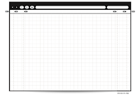
For my website wire frames and sketches, I use a Paper Browser (http://www.raincreativelab.com/paperbrowser/).
Thursday, May 26, 2011
Reading Recommendation

I'm reading Sketching User Experiences by Bill Buxton for Deb Satterfield's 595X Human Interaction Design class this summer. While I don't intend this blog post to be a book review, I want to express how much I can't put this book down.
First, a little back story about me: I received my BS in Visual Communication from Ohio University in 2001. Since then I've been primarily designing websites and legal animations, as well as print marketing for small companies in Chicago, IL.
As an undergrad I took a few classes in experience and usability, however, those terms were buried in the over-all encompassing Design Class. In my 'real world' experiences UX and UI is the elephant in the room. No one wants to address it, but they want a top-rate product. For the past few years I've been reinventing the process of how I approach design to better incorporate for future-use and usability. These concepts have always interested me and are the primary reasons that I am getting my MS in HCI.
Getting back to the book - I've been reading a lot of books on the subject, but probably would have overlooked this gem (because of the title) if not for Deb's class. The author addresses many topics that interest me (work environment issues with the 'design' process / the actual process / wireframing / prototyping) and many that I wasn't aware of (video environment) or that I took in to consideration as part of the process (play).
If you are interested in Practices in Human Computer Interaction (which I hope you are since you are in Mike's class this summer) I recommend picking up a copy of Sketching User Experiences - it is a quick read, highly informative and a book that I will most certainly go back to reference.
[Image used without permission from: http://www.amazon.com/Sketching-User-Experiences-Interactive-Technologies/dp/0123740371]
