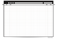
With our last class focused, quite exclusively, on digital wireframing, I wanted to sing the praises for the more traditional side of the line – Paper Wireframes. Gasp – I know! How dare I suggest that someone disconnect from their computer, dust off their sketchbook and pick up a pencil?!?
In my design experience I’ve found that, when trying to get as many ideas out in a short amount of time, it is faster and easier to put it on paper. With paper and pencil there is no learning curve or bugs to work out. You aren’t relying on your hard drive (or an external server) to not crash and lose your work. One point that is equal in both uses is the disposable “throw away value” (Buxton, Sketching User Experiences) of each medium. Remember, the more ideas you get out in the least amount of time, the more likely you are to find a great concept. Alternatively, the less time you spend on each concept, the less connected you will be when the client rips it up – figuratively or literally.
I’m not suggesting that you un-tether from your computer completely. Once you’ve found the design you will move forward with, this is the point to open a design program and create a medium-fidelity mock up of your design. Hopefully by this point you’ve worked through the kinks in your wireframes, communication with the client, personas and low-fidelity sketches that you’ve created a design / interface / experience far superior to simply jumping in to a digital design.
For my website wire frames and sketches, I use a Paper Browser (http://www.raincreativelab.com/paperbrowser/).
I would agree with on using an old fashion pen and paper. I don't prototype that much any more, but in my past experiences I have found this to be faster because I tend to get caught up in making things align, and using the same font, etc., when none of that is important right at the beginning.
ReplyDeleteThanks for the great tool on paper browsers! That is really neat. And yes, although I am currently learning several different digital tools for prototyping, I find it very intuitive to sketch on a paper. In fact in my earlier experience, I used to use Illustrator a lot. I found Illustrator valuable in being able to make quick sketches digitally without too many widgets to learn.
ReplyDeleteLike Sheri points out, when using wireframing/sketching tools that are a bit more visually polished, I feel like it's easy for clients/stakeholders (let alone those producing the wireframes) to get caught up in details that are out of scope for such initial ideation. This is a problem I experienced when showing various departments the wires for the light re-design of cfr.org, which I am currently leading -- instead of focusing on proposed layout changes, for example, they questioned whether the font used throughout the wires was on brand or not.. this has prompted me to display wires in much more rudimentary fashions, e.g. using pen & paper and/or tools like Balsamiq (because of that hand drawn look).
ReplyDeleteI think another important point to make in this regard is that using pen and paper is the easiest way to include stakeholders in a hands-on way. When I've shown digital wires to clients, they often want to *show* me their feedback, but they don't have experience with tools even as simple as Balsamiq. When we're looking at a piece of paper, it's easy for them to pick up a pencil, erase certain things, and visually demonstrate their feedback to me -- very helpful!
This comment has been removed by the author.
ReplyDeleteThank you Ryan! When the iPhone first came out I was so excited to be able to quickly store my thoughts and tasks on my phone all in one spot, but I still find myself today jotting them all down on post it notes. There is something quick and easy about the seemingly infinite possibilities of a pencil and pad of paper that computer systems and interfaces limit the user in having.
ReplyDeletePerhaps an interesting project would be use Garratt's Impromptu Buttons to create interactive touch or web interfaces from sketched ideas! (http://www.ros.org/wiki/mit-ros-pkg/KinectDemos/ImpromptuButton)
I agree, I found myself spending hours trying to find all the right widgets so that I could design more quickly.... well defeats the purpose I suppose. I like to do my first sketches by hand. I will do about 5 - 10 on one page, then when I figure out the basic layout I move on to a page per.
ReplyDelete